AMPATH Logo

The main AMPATH logo is considered the three-person logo, AMPATH name and “Leading with Care” tagline. This is the AMPATH logo which should be used in most circumstances.
The three gender-neutral people in the logo represent the tri-partite mission of AMPATH: care, education and research. The person at the top, in the dark blue which matches the color of the name AMPATH, signifies the care mission, which leads the way. The people are holding hands, which represents the partnership aspect of AMPATH and the academic health partnership.
The text of AMPATH also leans forward, to show that the organization is constantly moving, evolving, and is also known as forward-thinking.
The logo may be used without the “Leading with Care” tagline when necessary for space, size or design considerations.
Logo Placement
- Each logo should have its own space. When used with other organization logos, such as those from partner institutions, each logo should have its own space so that they do not compete with one another. These guidelines apply to AMPATH location logos when used together as well.
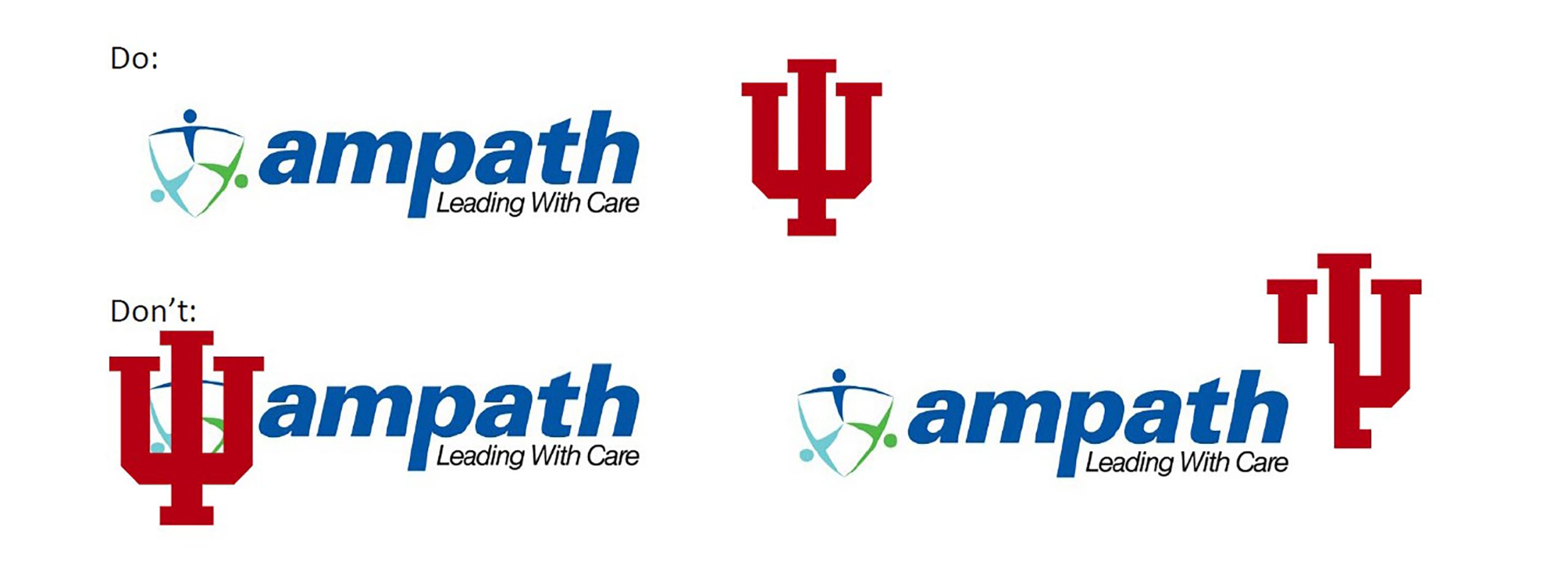
2. The AMPATH logo should always be of equal or greater size than the partner logo with which it is being used, unless express permission has been received by the AMPATH Consortium administrative office at the IU Center for Global Health Equity. As logos are often shaped differently, best judgment should be used when determining the correct size needed.

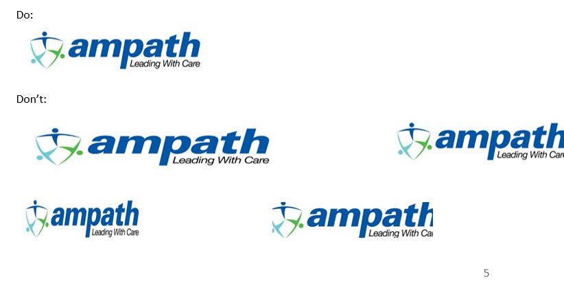
3. The logo should be visible. The logo will lose impact if it’s reproduced any smaller than .25” or 6 mm.

4. The logo should not be distorted by cropping, trimming, stretching or condensing. Proportions should be locked so that the height and width stay proportional when resizing. The logo should not “bleed” off the page.
Colors and Fonts
See appendix.
Use of the Logo
Institutions that are members of the AMPATH Global network should use the AMPATH name and branding in their partnership activities. This includes using the AMPATH logo on all materials that describe initiatives with partner institutions. For example, the logo should be used on poster presentations at conferences describing work or research, website references to involvement in AMPATH, press releases, publications, etc. The main AMPATH logo is preferred unless there is a business interest for using the AMPATH Global or one of the AMPATH location logos
Use of the AMPATH logo in conjunction with the logos of the AMPATH partners is encouraged, as presented in this document.
Per AMPATH’s contract with USAID, the USAID logo must be used in conjunction with the AMPATH logo on any activity that is funded directly by USAID. This will mostly be relevant for the usage of the AMPATH logo in Kenya. When using the USAID logo in conjunction with AMPATH, the USAID logo must be of equal or greater size and be placed side-by-side with the AMPATH logo.
The AMPATH logo should never be used or recreated by anyone not associated with AMPATH. Any person or organization wanting to use the AMPATH identity must obtain the logo files from personnel directly associated with AMPATH and the files should not to be manipulated in any way.
Location sub-brands
Within each host country, AMPATH activities can be described using the main AMPATH name and logo including the “Leading with Care” tagline. The country name is not necessary unless there is a business reason to do so.
When necessary for differentiation, specific AMPATH partnerships should be referred to as AMPATH Kenya, AMPATH Ghana, AMPATH/MAPAS México, AMPATH Nepal etc. Please refrain from using a dash between AMPATH and host country name.
Location logos are available for each AMPATH Global location.
- No alteration of logo color, location or typeface is permitted.
- The main AMPATH logo should be used for external promotion and on materials unless there is a business purpose to differentiate the AMPATH location by using the location logo. (For example, if research is being presented at an international conference where representatives of multiple AMPATH country partnerships might be present).
- Tagline may be translated into local language (must use official branding). The AMPATH Consortium Administrative office can assist with this.
- The location text should appear in green (except for Kenya which will be designated as the founding AMPATH location with the turquoise designation).
- Location logos can be printed in full color, black or white.
Examples:




- The stacked logo variation (above) is the preferred orientation, but a horizontal version is available when needed for spacing purposes.
Example:

If a project involves two or more AMPATH partnership locations, consideration can be given to using the AMPATH Global logo for identification.
Example:

Other names such as IU-Kenya Partnership are discouraged in order to build name recognition for the AMPATH Global network of partnerships.
