
12 Data Visualization and Data Storytelling
Data doesn’t speak for itself
This chapter will help you and your team use data in meaningful ways that enhance your message through impactful data visualizations and data storytelling.
What are data visualization and data storytelling?
Throughout the chapter there are two terms you will need to know: data visualization and data storytelling.
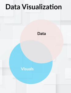
Data visualization takes data and represents it in graphical ways. The visualization of data helps an audience digest information quickly by showing patterns, trends, or relationships.
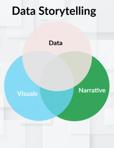
While data visualization helps make the data easy to digest, data storytelling uses elements of narrative to help make the data memorable and increase the odds that the data translates into action by your audience.
Data + Visuals + Narrative = data storytelling
This chapter is aimed at helping you understand the elements necessary to create and use effective data visualization and craft data stories that illuminate the significance of your insights for your business audience.
LET’S BEGIN!
Your team has done their research and collected a lot of data that you are excited to share with your audience, but you don’t know where to start. Let’s go through the process of building your team presentation data story together. At times you may have to go back to a previous step if you find that something has changed, or a new insight is revealed. The more flexible you are at this stage the better. Below are the key steps we will explore, with hyperlinks to each section: use these to travel through the material easily.
To create a data presentation, your team needs to answer these questions:
-
Who is your audience?
-
What are your main insight(s)?
-
Ensure the insight is relevant to the needs, goals, and priorities of your audience.
-
-
How can you best construct a story to highlight those insights?
-
How can you create clear visualizations of the data for your audience so that they take away the message you intend?
-
Types of visualizations
-
Design principles
-
WARNING 1: Don’t build your slides yet
At this stage, you might be tempted to start creating slides. Resist this urge. While it seems like you are saving time, starting with slides makes it harder to adapt to new findings. Instead, use paper, a white-board, post-it notes, or a digital tool with similar flexibility. Starting with slides can shift your focus from the message to the slides themselves, making it difficult to change direction later.
WARNING 2: Beware the curse of knowledge
The “curse of knowledge” is a psychological process that makes it difficult to remember what it’s like not to know something. For example, teaching a child to tie their shoes or explaining a phone feature to an older relative can be challenging because it’s hard to recall not knowing how to do these tasks. When presenting data to you audience, remember that it may be new to them. Maximize impact by keeping your presentation of data logical, simple, and focused.
Who is your audience?
In addition to the audience analysis you have performed to identify useful psychographic and demographic information, you should ask a few questions about your audience that focus on their data literacy.
-
-
- Do they work with a lot of quantitative data as part of their normal work? If so, you can probably have more elaborate, detailed data (think about presenting it to a group of statisticians).
-
-
-
- Do they not engage with as much detailed data in their day-to-day work? They might appreciate more narrative and images to represent the data.
-
For example, let’s say that a data analyst is addressing an audience of other analysts. This audience might have an easier time quickly digesting more complex data because they deal with it all the time. But let’s say the same analyst is presenting to a group of managers who rarely interact with complex data. They might appreciate visualizations that present the key finding without requiring them to do their own analysis on the spot.
You need to keep your audience in mind throughout the whole process, from planning to presentation. Audiences are no different from you! They are busy and they are distractible. Therefore, you should focus on efficiency–how can you make your message clear and avoid overloading the audience with unnecessary distractions, like too much information or too much visual noise in your presentation? Think about sitting in a lecture on a topic that isn’t interesting to you. Do you pay attention or do you quickly zone out? What happens if your instructor shows how the information they are sharing is relevant to you? Now you might be inclined to listen more. Audiences in business settings are no different. Your priority needs to be showing how what you have to say is relevant to them. How does what you are sharing help them make decisions and enact courses of action that are meaningful to them? If you’ve done a good job, at the end of the presentation your audience should be able to easily remember what it is they need to do.
What are the main, relevant insights from your data?
After collecting your research data, it’s time to organize your findings. Follow these steps:
- Document your insights
- Create a single Word document to organize your insights using the dot-dash method from McKinsey (dot=insight/main point; dash=evidence). Avoid starting with slides or narratives.
- Analyze your data
- Spend time analyzing your data to identify patterns and insights. This can be the most mentally taxing part of the process, so try to do this during your peak performance time for best results. Remind yourself of the situation or the problem you are trying to solve. Are you sharing information and letting the audience draw their own conclusions? Or are you proposing a solution to a problem? What does the audience already know and what do they need to know?
- Team Collaboration
- Work with your team to avoid bias. Ensure you are not just looking for data that supports your existing viewpoint.
- Together, select the data that best helps your audience understand the value of your proposed solution.
- Make sure your insights clearly identify:
- why your audience should care.
- what you want your audience to do based on the data.
- the business impact of your insights.
- Your data should clearly answer the question, “so what?” Quantifying the pain or opportunity for your audience helps.
Illuminating insights: Finding your story line
Now that you have identified your insights and understand their significance to your audience, you can begin to create your story. Break down your findings into a logical sequence and pick a theme. Have each team member independently come up with an organizational structure/theme. When you meet, choose the structure that the team collectively thinks works best. Starting independently can foster greater creativity, as brainstorming together may inadvertently limit creative output.
Data Storytelling
Stories are powerful tools for communication. We are more likely to remember facts and ideas that are wrapped in stories, rather than presented as mere statistics or even statistics with a visualization. A study from The London Business School (2014) showed that a statistic alone will be remembered by only 5-10% of an audience. Adding a visual increases this to 25%. Combining a statistic with a visual and a story boosts retention to 65-75%. Harnessing the power of stories for your data can make your presentation more memorable and persuasive.
Crafting a Compelling Data Story
All stories share a fundamental structure, and data storytelling is no different. The goal of your data story is to guide your audience from their problem to your solution. To make your data story clear and engaging for your readers, you can structure it using this universal narrative framework (for a video explanation of the process, you can watch this video).
Beginning/Setup→Middle/Conflict→End/Resolution
Beginning/Setup: Background, set the scene, hook the audience, name the key players
Middle/Conflict: Supporting data that culminates in an “aha” moment (your insight)
End/Resolution: Solution and steps forward, ending with call to action.
Recalling Freytag’s pyramid from previous chapters, you can also break down the narrative structure like this:
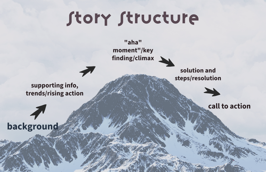
Here is an example of how using a story structure helps build data into a story
In the past, our customer satisfaction rates soared, bringing us steady success (beginning that sets the scene). But then, shifts in industry regulations disrupted our operations (middle reveals conflict). As a result, our service offerings no longer met market demands (continuation of middle showing consequences of conflict). Now we must realign our strategy to regain our competitive edge. Based on a comprehensive analysis of the way our competitors are adapting to new regulations (supporting data that will lead to your insight or “aha” moment), we recommend advanced training to update staff on emerging protocols and new customer satisfaction surveys (resolution of conflict with solution and steps).
Creating your visualizations
You encounter hundreds of data visualizations daily. Let’s explore some common types and when to use each.
Types of Visualizations
1. Bar Graph
- useful for comparison
- variations include: cluster bar chart, stacked bar chart, 100% stacked bar chart
2. Column Graph
- useful for showing change over time
3. Pie Chart
- displays value against the total
- easy to understand relative values within a whole
- variations include: donut chart
4. Line Chart
- illustrates trends and outliers in data over time
5. Scatterplots
- shows the relationship between two variables
- can indicate positive/negative correlation or no correlation, and highlight outliers
6. Infographics
- combines various visual elements to present information succinctly and engagingly
- makes information engaging and easy to understand at a glance
CAUTION: avoid 3D effects because they make graphs hard to read!
Design Principles
Your data slides need to be understandable at a glance. Below are some guidelines to help you edit and make choices to enhance visual impact for your audience.
- Convey a single idea: Make sure your data slide conveys 1 idea and 1 idea only. This will help prevent information overload. If you want to convey another idea, either add a new slide, or incorporate an animation to introduce the next idea.
- Less is More
- Limit colors, fonts, and text
- Max of 2 fonts
- Choose easy to read fonts
- Bold can be used for headlines, titles, or words you want to emphasize
- Bright colors attract attention
- Elements placed at the top and center tend to draw the audience’s attention
- You can always link to the full data set and/or put it in your appendix
- Eliminate gridlines when possible
- Direct labeling is more audience-centered
- Show your audience where they should look
- Utilize Preattentive Visual Attributes: Preattentive attributes are attributes we notice without conscious effort. For example, your brain quickly notices contrasting colors or differences in height. Consider the following pre-attentive attributes in your design:
- Length and Width
- Size, Shape, and Orientation
- 2-D spacing and spatial grouping
- Color and Texture
- Positioning and Alignment
- Utilize Preattentive Visual Attributes: Preattentive attributes are attributes we notice without conscious effort. For example, your brain quickly notices contrasting colors or differences in height. Consider the following pre-attentive attributes in your design:
- Take advantage of Gestalt principles. Gestalt principles relate to how we perceive visual elements as a whole. Utilize these principles to enhance your design.
- Law of proximity—elements that are close to each other are perceived as a group.
- Law of similarity—elements that are similar are perceived as related
- Law of closure—the mind tends to fill in missing information to create a complete image
- Law of symmetry—symmetrical elements are perceived as part of the same group
- Law of continuity– the eye is drawn along paths, lines, and curves, preferring continuous figures.
- Law of past experience—elements are perceived based on past experiences
-
Use headlines for your slides instead of simply labels. Often we simply label our slides. What’s more effective, however, is to avoid simply labeling and instead create a headline. An effective headline:
- Describes the data clearly
- Does not make logical leaps
- Contains a verb
A good test to make sure you have a headline and not a label is to identify a verb. If it has a verb, it is a headline. If not, it is probably just a label.
Examples of Labels versus Headlines
-
LABEL HEADLINE Quarterly sales report → Q3 sales show mild increase Sales Trends → Sales trends are declining since COVID Market Share Analysis → Market share has remained stagnant for past 3 years. Retail e-commerce sales worldwide from 2014-2027 → Worldwide sales are up 8-fold from 2014-2027
Additional Resources
The Economist has great examples of data visualizations.
Datawrapper is a tool you can use to build your own visualizations.
Rubric that can be used to check your data visualization
Want to learn more about data visualization, but would prefer to listen? Check out storytelling with data’s podcasts.
Exercises you can use to practice from storytelling with data.
Example of an advanced use of data storytelling.
Example Exercise
Here is a pie chart with fabricated data (remember, pie charts can be helpful visualization when you want to show a part of the whole. We know that a full pie=100% so we can easily see a rough idea of relative share of the pie).
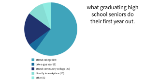
Image credit Michelle Powell, created with Adobe Express. In this first iteration, when you look at the pie chart, what do you notice?
If you were given only 15 seconds, do you think you could glean the main point? What, if any aspects get in your way?
Image credit Michelle Powell, created using Adobe Express. Above is a revised version of the same pie chart. What changes do you notice? Do you find this chart easier to read quickly?
For more practice, follow along with this video to watch experts make design choices.

References
Chamorro-Premuzic, Thomas. “Why Group Brainstorming is a Waste of Time.” Harvard Business Review, 25, March 2015, https://hbr.org/2015/03/why-group-brainstorming-is-a-waste-of-time. Accessed 26, February 2025.
Future of Storytelling. “Empath, Neurochemistry and the Dramatic Arc: Paul Zak and the Future of Storytelling,” YouTube, www.youtube.com/watch?v=q1a7tiA1Qzo. Accessed 25 Feb. 2025.
Galletta, Dan. “Storytelling in PowerPoint: Learn McKinsey’s 2 step framework,” YouTube, . https://www.youtube.com/watch?v=CY1Y367KEko. Accessed 23 Jun. 2024.
Harvard Business Review. “Telling Stories with Data in 3 Steps (Quick Study). YouTube, www.youtube.com/watch?v=r5_34YnCmMY. Accessed 26 Feb. 2025.
MIT Sloan Executive Education. “4 Foundational Tactics for Better Visual Data storytelling,” www.youtube.com/watch?v=MZf5YTdSRnE&t=1518s. Accessed 26 February 2025.
Monarth, Harrison. “The Irresistible Power of Storytelling as a Strategic Business Tool,” Harvard Business Review, 2014, March 11. www.hbr.org/2014/03/the-irresistible-power-of-storytelling-as-a-strategic-business-tool. Accessed 26 Feb. 2025.
Nussbaum Knaflic, Cole. “How to turn data into Stories, Storytelling with Data,” Youtube, www.youtube.com/watch?v=Hfx1X9WSGYQ. Accessed 26, February 2025.
Nussbaum Knaflic, Cole. Storytelling with Data: A Data Visualization Guide for Business Professionals, Wiley, 2015.
Reynolds, Garr. “Why Storytelling Matters.” TEDxTalks Kyoto, YouTube, www.youtube.com/watch?v=YbV3b-l1sZs&t=234s. Accessed 26 Feb 2025.
takes data and represents it in graphical ways. The visualization of data helps an audience digest information quickly by showing patterns, trends or relationships.
