
Data Analysis in Microsoft Excel
Chapter 13 – Charts
INTRODUCTION
A big part of analysis is visually appealing graphs and charts. While we also work on Pivot Tables in this class, which are another way to visualize information and to help our users understand data.
- Create and understand PIE, BAR, and COMBO charts based on data in a table
- Create PivotTables to look at data in a new way
Guided Exercises
Open the Chapter13_Charts file.
The CustomerAnalysis worksheet shows what products each vendor of a furniture store sells during 2024. You would like to create a visual to show how many transactions each vendor had as well as how much revenue each vendor brought into the store. Before you can do that, the data need to be summarized.
- In cell H4, use a function to return the number of transactions the customer in cell G4 had during 2024. Fill the function down through cell H8 to return the number of transactions for each vendor.
- In cell I4, use a function to return the total revenue the vendor in cell G4 brought in during 2024. Fill the function down through cell I8 to return the total revenue for each vendor. Format as Accounting.
- Now that the data is summarized, a chart can be created. Delete any charts that may already be on this worksheet. Select the data in cells G3:I8 so that vendor names and column headings are selected as well as the corresponding values.
- Insert a Clustered Column – Line on Secondary Axis chart.
- Position it over the shaded area in cells G12:M27.
- Change the Chart Style to Style 2.
- Change the Chart Title to 2024 Vendor Transactions. Make the font size 20pt and change the font color to Blue, Accent 1, Darker 25%.
- Add Axis Titles to the Primary Vertical and Secondary Vertical axes, but not the Horizontal.
- Change the axis title on the left to read # of Transactions. Change the font to 12pt, Century Gothic.
- Change the axis title on the right to read Revenue. Change the font to 12pt, Century Gothic.
The completed Clustered Column – Line on Secondary Axis chart should look like the following image:
![]()
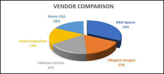
Another good chart for this data is a pie chart which can show how each category vendor to the whole set of data, especially if you’d like to display percentages.
-
- Select cells G3:I8 again and insert a 3-D Pie Chart. Place it over the shaded area below the chart above, in cells G27:M39.
- Change the Chart Title to Vendor Comparison.
- Change the Chart Style to Style 8.
- Click the Select Data button in the ribbon, and notice you can turn off # of Transactions and just have Total Revenue.
- Find More Options for the Data Labels, clicking the three bars called “Label Options”. Under Label Options, check to add Percentage
- If you wish, you can click and drag one of the pie wedges (e.g.; B&B Spaces is the largest) out to emphasize it.
- Your finished chart should look something like this:
Website Traffic Analysis
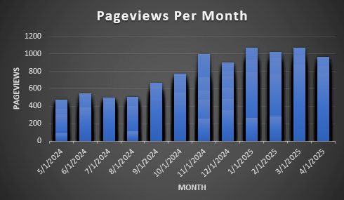
In the WebsiteTraffic worksheet, create a column chart that shows the monthly website traffic for the Haptown main website.
- Select cells A3:B368 and insert a Clustered Column bar chart.
- Change the title to Pageviews Per Month
- Change the style to Style 9
- Double-click the dates on the horizontal axis and change the Base option to Months.
- Add Axis Titles and use Month for the horizontal and Pageviews for the vertical.
- Your finished column chart should look something like this:
Sales PivotTable
The SalesData worksheet contains data from the furniture store’s 2024 transactions. The data on this worksheet is nicely organized, but there is a lot of it! We can use a PivotTable to further summarize the data so that it can be explored interactively.
- Select the SalesPivotTable worksheet. Notice that cell A4 has a fill color. This is the cell that we are going to choose as the location for the PivotTable.
- Go back to the SalesData worksheet and select one cell that has data in it.
- Click on the Insert tab and then click on PivotTable on the far-left side of the ribbon.
- In the Create PivotTable window that opens, confirm that the range of data is in the box at the top.
- Click on the button near the bottom, next to Existing Worksheet.
- Click in the box next to Location.
- Click the SalesPivotTable worksheet.
- Click in cell A4. Click OK.
- Notice the PivotTable Fields list on the right side. This is where we will set up which fields are the columns of the PivotTable and which fields are the rows of the PivotTable as well as which values are summarized and in which way they are summarized.
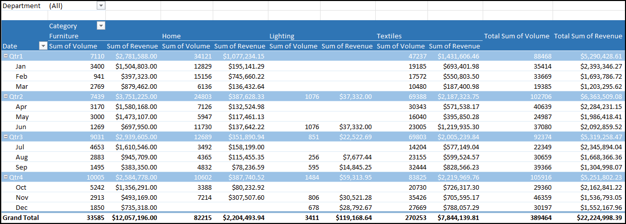
- Look at the image below of what your finished PivotTable will look like. Above the PivotTable, in cells A3:B3 is a filter so that the data can be filtered down to different departments. In the Fields List, drag the Department field to the Filters area of the design.
- The categories are each in their own column. Therefore, drag the Category field to the Columns quadrant.
- The rows are related to when the transactions took place. Therefore, drag the Date field to the Rows quadrant.
- Notice that Months will be added as well so that Excel will group the date by month. We will also group by Quarter later.
- The actual data inside the PivotTable are totals of the volume and revenue amounts. Therefore, bring the Volume field into the Values quadrant.
- Notice that the name of the field changes to Sum of Volume.
- Then, bring the Revenue field into the Values quadrant, making sure it is placed under the Volume.
- Notice that the Revenue field becomes Sum of Revenue.
- Click on the Sum of Revenue field and select Value Field Settings. Click on the Number Format button. Select Currency as the format of this field. Click OK and OK again.
- Rename this to “Revenue Sum”.
- Rename the Sum of Volume values field to “Volume Sum”
- Close the PivotTable Fields list.
- Change cell B4 to Category by typing over it. It’s ok, it will still remain a drop-down.
- Change cell A6 to Date by typing over it.
- Right-click on any one of the months and choose Group. Deselect Days and Select Quarters, then click OK.
- Change the PivotTable style to White, Pivot Style Medium 1.
- Use the PivotTable to answer the questions in column M. After you are finished answering the questions, make sure any filters you used are cleared so that your PivotTable looks like the image below.
The finished PivotTable should resemble this image (but Grey instead of Blue):
If you are going to stop working here, make sure your file is saved. When you close it, if there is any unsaved work, Excel will prompt you to save. Make sure the most recently worked file is in your IU OneDrive with the proper date modified timestamp.
More Practice
Work you should do before our next class
Open the Chapter13_Charts file.
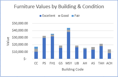
The AssetAnalysis worksheet contains current values of Furniture assets in Haptown, as well as the building code and condition. Before we can generate a useful visual chart, the data need to be summarized.
- In cell G4, use a conditional aggregate with mixed-cell referencing to calculate the revenue for the building and condition. Fill the formulate across and down to I13. Format as Accounting as needed.
- Select cells F3:I13 and insert a Stacked Column chart. Place it over the shaded area in cells F15:I27.
- Change the Chart Title to Furniture Values by Building & Condition.
- Change the Colors to Colorful Palette 2.
- Move the Legend to the Top.
- Add Axis Titles to both axes.
- Change the horizonal axis title to read Building Code. Change the font size to 12pt.
- Change the vertical axis title to read Value. Change the font size to 12pt.
- Format the chart outline to have a thin blue color.
The completed Stacked Column chart should resemble the following image:
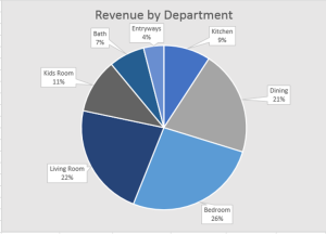
The DeptAnalysis worksheet contains a company’s transaction data from 2024. You want to summarize the data for each department so that you can create a visual that shows what percent of the revenue each department’s products brought in to the company.
- In cell K4, use a function to find the number of transactions for the department given in cell J4. Fill the function down to cell K10 to find the number of transactions for each department.
- In cell L4, use a function to find the total revenue from the sales of items in the department given in cell J4. Fill the function down to cell L10 to find the total revenue for each department. Format the values as Accounting.
- The visual should just show each department’s percent of the revenue, so select cells J3:J10, hold down the Ctrl key of your keyboard, and select cells L3:L10. You can release the Ctrl key.
- Insert a 2-D Pie Chart and place it over the shaded area in cells J12:O31.
- Change the title of the chart to Revenue by Department. Make the font 16 pt.
- Change the fill color of the Chart Area to Light Gray, Background 2.
- Add Data Labels in the form of Data Callouts.
- Remove the Legend.
- Change the colors of the chart to Colorful Palette 2.
The completed 2-D Pie Chart should resemble the following image:
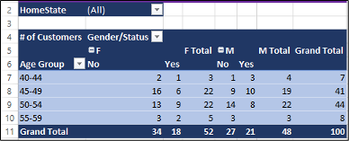
Customer Data PivotTable
Open the Chapter13_Charts file.
The CustomerData worksheet contains some demographic data about customers as well as how much each customer spent in 2024. You are going to use this data to create a PivotTable that will summarize the data and make it easier to analyze the demographics of the customers.
- Select a cell that contains data on the CustomerData worksheet.
- Insert a PivotTable in cell A4 on the CustomerPivotTable worksheet.
- Set up the PivotTable according to these steps to make it look like the image below the directions.
- Filter the data by HomeState.
- The columns of the PivotTable contain both the gender and the marital status of the customer. Add both of those fields to the Columns quadrant, making sure that Gender is first and Married? is below that.
- The Rows of the PivotTable contain the ages of the customers, grouped in ranges of 5 years. Add the Age field to the Rows quadrant.
- The PivotTable table should show the number of customers in each age group, for each gender, and for each marital status. Each customer has a unique CustomerID and these can be counted to examine how many customers are in each age group. Add the CustomerID field to the Values quadrant.
- In column A, right-click on any of the ages and choose Group. In the window that appears, change the By: value to 5. Click OK. The ages should now be in the intervals shown in the image.
- Change cell A4 to # of Customers. Remember this is done in a special place for Values fields!
- Change cell B4 to Gender/Status.
- Change cell A6 to Age Group.
- Change the PivotTable style to Dark Blue, Pivot Style Dark 2.
- Use the PivotTable to answer the questions to the right. After you are finished answering the questions, make sure any filters you used are cleared so that your PivotTable looks like the image below.
The finished PivotTable should look like this image:
You may now save and close your Excel workbook. Make sure the most recently worked file is in your IU OneDrive with the proper date modified timestamp.
Note