34 Empirical Model
Empirical model refers to a model constructed based on real-world data, either observational or experimental. At times this term is used in contrast with a theoretical model, a model constructed based on realistic simulations that are difficult, dangerous, or morally unacceptable to be carried out, or resources required to conduct an experiment is incredibly immense.
In this section, we begin with an elementary-level model fitting. Model-fitting is inherently regressive. That is, contrary to the usual procedure to draw a graph based on the equation we have by plugging in a few values in the domain, we are trying to find a pattern, or an equation, between the variables of interest, that best-fit the given data with least errors.
Let us begin our exploration by constructing a simple one-term model with the given hypothetical dataset.
![\[ \begin{array}{c|cccccc} x &1.5 &2.5 &3.5 &4.5 &5.5 &6.5\\ \hline y &1.837117 &3.952847 &6.547900 &9.545942 &12.898643 &16.571813 \end{array}\]](https://iu.pressbooks.pub/app/uploads/quicklatex/quicklatex.com-3cb0af0aa639dd5dfcd1810f15203304_l3.png "Rendered by QuickLaTeX.com")
First, let us try to find a pattern with a scatter plot (Figure 16). The dotted lines represent a best-fitting trendline generated by Microsoft Excel. Panel A fit a linear model, and Panel B fit a second order polynomial. While it appears the straight line provides a good fit over the given data, the fitting with a polynomial seems to have a better fit. Therefore, let us proceed with the polynomial model.
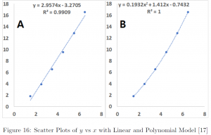
However, it is conventional to fit a model with a straight line. One of the main reasons is the ease with the comparison of errors. By comparing errors, we can determine the superiority of one model over others, however it is not easy to compare the errors over models of different order, e.g. linear vs polynomial, or linear vs non-linear. Therefore, we linearize the data either  or
or  singularly, or both, by transformation. In our example, we can compare which provides a better fit, linear model vs second order polynomial, by fitting
  vs .
vs .
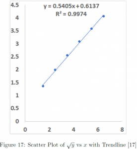
Note that in Figure 17, it should be read as , and therefore, the regressed line is
![\[\sqrt{y} = 0.5405x+0.6137\]](https://iu.pressbooks.pub/app/uploads/quicklatex/quicklatex.com-77c20a45ec74af2380c4371cd57be21e_l3.png "Rendered by QuickLaTeX.com")
Therefore,
![\[y = (0.5405x+0.6137)^2\]](https://iu.pressbooks.pub/app/uploads/quicklatex/quicklatex.com-0dec2308676655fe5d870262af04438d_l3.png "Rendered by QuickLaTeX.com")
In the fitted models above, we see  , all of which close to 1, except in panel B equal to 1. What does this denote?
In short, represents how well the model we have explains the given data. However, to formally define , we first need to go over a few important terms related to a model-fitting. While there are many criteria to fit a model, one standard way is using a least-squares method, and determine models with smaller errors a better one. There are 3 kinds of errors as follows:
1. Sum of Squares Total (SST) is a measure of the total variation in the dataset, defined as the sum of squares of the difference between each observation and the mean.
![\[\text{SST} = \sum^n_{i=1}(y_i-\bar{y})^2 \]](https://iu.pressbooks.pub/app/uploads/quicklatex/quicklatex.com-dd4aff4849490f8b6c37186f0b3a3e48_l3.png "Rendered by QuickLaTeX.com")
2. Sum of Squares Due to Regression (SSR) is a measure of variation explained by the model, defined as the sum of squares of the difference between each predicted value and the mean.
![\[\text{SSR} = \sum^n_{i=1}(\hat{y_i}-\bar{y})^2 \]](https://iu.pressbooks.pub/app/uploads/quicklatex/quicklatex.com-07fda2f3e4422435595fbabfca3972a4_l3.png "Rendered by QuickLaTeX.com")
3. Sum of Squared Errors (SSE) is a measure of variation not explained by the model, defined as the sum of squares of the difference between each observation and the predicted value.
![\[\text{SSE} = \sum^n_{i=1}e_i^2 \]](https://iu.pressbooks.pub/app/uploads/quicklatex/quicklatex.com-9ef16940d378fb5a8214e9e771526721_l3.png "Rendered by QuickLaTeX.com")
Naturally, it follows the more variation explained by the model, the better the model. In other words, the higher the value, defined as the proportion of SSR over SST, the model has a good fit.
![\[ R^2 = \frac{\text{SSR}}{\text{SST}} = 1-\frac{\text{SSE}}{\text{SST}}\]](https://iu.pressbooks.pub/app/uploads/quicklatex/quicklatex.com-18e153c0a8532690752a7434d761c1cc_l3.png "Rendered by QuickLaTeX.com")
Therefore, we can see a slight improvement in from 0.9909 to 0.9974 by fitting vs  over vs . Note that the of panel B is equal to 1. This means the observed data perfectly line up on the fitted model. In a real-world situation, this is highly unlikely and once this happens many would suspect the data actually have been cooked, i.e. manipulated, than to be authentic.
Now, we introduce the notion of power of ladder, the hierarchy of data transformation.
Power of Ladder
![\[\begin{array}{c|c|c} \text{Power} & \text{Transformation} & \text{Name} \\ \hline \vdots & \vdots & \vdots \\ 3 & y^3 & \text{Cubic} \\ 2 & y^2 & \text{Square} \\ 1 & y & \text{Original} \\ \frac{1}{2} & \sqrt{y} & \text{Square root} \\ 0 & \log_{10}y \text{ or } \ln y & \text{Logarithm} \\ -\frac{1}{2} & -\frac{1}{2} & \text{Reciprocal root} \\ -1 & -\frac{1}{y} & \text{Reciprocal} \\ -2 & -\frac{1}{y^2} & \text{Reciprocal square} \\ -3 & -\frac{1}{y^3} & \text{Reciprocal cubic} \\ \vdots & \vdots & \vdots \end{array} \]](https://iu.pressbooks.pub/app/uploads/quicklatex/quicklatex.com-558aa06a7a0e681ef044fcdc9435762c_l3.png "Rendered by QuickLaTeX.com")
One commonly used criteria to determine how to transform the data is , the proportion of variation explained by the model. As such, the higher and the more close to 1, the better. However, there is a subtlety involved, where the sound judgement of a modeller is needed. Rethinking our example, by transforming into , indeed, we achieved an improvement in a model fit with an increase in from 0.9909 to 0.9974, at least in a technical sense. However, from a practical point of view, our was already almost 100% with over 99% of variability explained by the model. Would you assess 0.65% improvement meaningful?
That is a matter of judgement, not a matter of fact. While in general one might not really be able to make a convincing or persuasive argument the 0.65% improvement in from 0.9909 to 0.9974 is significant, there are instances such rigor is required, for example, in establishing any law of physics. However, most of the time when data transformation is deemed necessary, we gain a meaningful improvement in , for example, from 0.4 to 0.7 or so.
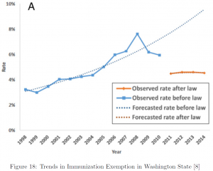
We conclude this section introducing a real-world example [8].
Exemptions from Mandatory Immunization after Legally Mandated Parental Counseling} [8]
The rapid increase in vaccine refusal or exemption at an alarming rate was a concern for health care professionals and the government. To tackle the issue, in 2011, the Washington State implemented implemented a senate bill to require counseling and a signed form from a health care professional for school entrants to be exempt from mandatory immunization.
In 2018, the evaluation of the impact of the legislation was published in the medical journal Pediatrics [8] with a great reduction in the exemption rates as well as the steep slope of increase turned to a plateau.
The modeling technique used in this research is interrupted time series, a variant of a linear model commonly used to evaluate a policy change, with a following regression equation:
![\[ \text{Rate} = a_ot+a_1p+a_2(p\cdot t)\]](https://iu.pressbooks.pub/app/uploads/quicklatex/quicklatex.com-9b1501c34f904a2f13d2a30f5685a78e_l3.png "Rendered by QuickLaTeX.com")
where  is time in years,
  is a binary variable denoting policy implementation, and
  adjusts for possible interaction between the two variables.