
2. Create Dot Density Map
Dot Density Map
(Explain more about the Dot Density Map.) Now, we will make a dot density map of the total population.
1. Right-click US_counties_acs.shp and open Symbology. Click the drop-down icon in the Primary symbology and click Dot Density.
2. Zoom in on the county (or counties) that you want to present.
3. Change the default color, Dot Size, and Dot Value to find the best combination between them – you might need to adjust them several times to get a visually efficient map. Here is an example:
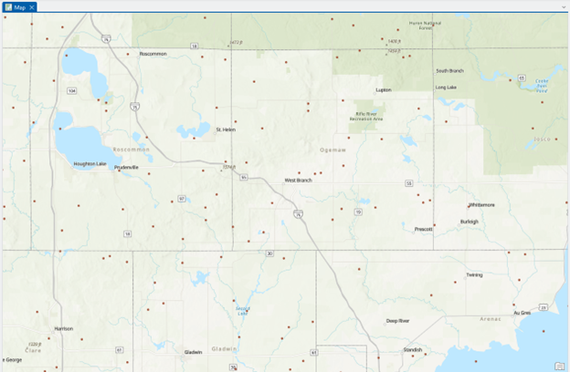
Figure & Question (2 pts.)
1. Figure: Make a screenshot of the location that you selected.
2. Question 1: Are the positions of each dot within your selected location meaningful? In other words, does each dot’s size and position physically represent the county’s population? Explain why you think so.
4. Zoom to the full extent by right-clicking the “US_counties_acs.shp” and selecting Zoom To Layer.
Map (1 pt.)
Make a professional dot density map of the US total population by
- Insert Legend, Title, North Arrows, and Scale bar.
- Insert the Text “Credited by US Census Bureau and Data in 2020” and make it italic.
- Save the map as population_USCensus2010.jpg