
3. Create Choropleth Map
You will make the county-level percent poverty map with the attribute Poverty in the US_counties_acs.shp. Per its description, the poverty attribute is the proportion of people in a county who meet the census definition of poverty. For example, based on the 2020 census, the poverty threshold was $13,788 for one person and $ 27,740 for a family of four. For more information about the Census definition and results of poverty, visit:
- Poverty definition and data: https://www.census.gov/topics/income-poverty/poverty.html
- How the Census Bureau Measures Poverty: https://www.census.gov/topics/income-poverty/poverty/guidance/poverty-measures.html
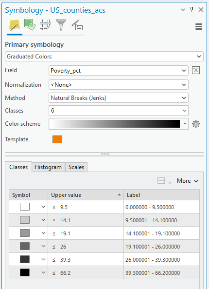
1. Open Symbology of US_counties_acs.shp. Click the drop-down icon and choose Graduated Colors
2. Select Poverty in the Field, Natural Breaks (Jenks) in Method, 6 in Classes, and choose your color scheme:
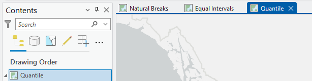
Then, you will make a map layout with multiple data frames, like Lab 2 – this time, include Natural Break, Equal Interval, and Quantile poverty maps.
3. Change the current Map frame name to Natural Breaks
4. Next, we will make a poverty map with the “Equal Interval” method. In the Insert tab in the ribbon, click the New Map button.
5. Copy and paste US_conties_acs from the Natural Breaks Map frame and change symbology, like Step 2, but choose Equal Interval in the data classification Method.
6. The last Map frame is the map by the “Quantile” data classification method.
You may also want to change the Basemap; please select any Basemap that makes the US_Counties_acs noticeable. Now, your Map frames look like the example below:
7. Open a map layout by Insert > New Layout, choose Letter 8.5’’ X 11’’, and insert the three Map frames.
8. To complete the map layout, we need to include other map elements:
-
- In the lower-right quadrant, insert the tile “US Poverty Percent in 2020”. Edit the location and fonts of the text to improve the visual presentation.
- Insert Text, ‘Credited by US Census Bureau in 2020’, and make it italic.
- Insert legend, scale bar, and north arrow.
Figure 3 (1 pt.): Map submission
Export your map with a figure format, e.g., TIFF, JPEG, BMP, etc., and upload it to Canvas. Please double-check that all map elements are visible and appropriately balanced. Your map should look professional!
Analyzing map
Examine the three maps to see how the spatial pattern of poverty differs due to the classification schemes. Look at the similarities and disparities in the maps and reflect these in your answers. Please focus on 1) the mechanisms of each fsys classification method, and 2) think about which classification is the most suitable to describe the spatial distribution of which case and why.
Stop and Reflect: Remember our Critical Cartography discussion!
Questions (2 pts.): Your map interpretation and analysis
1. Which data classification scheme would you choose as your final poverty map? Explain why you think that scheme best represents poverty in the US.
2. Choose ONE classification scheme that would not be used in the US poverty analysis and discuss why it would be the poorest choice.