
4. Change visualization; Basemap, symbols, text, etc.
Change Basemap
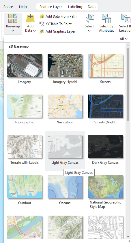
1. On the Map tab, in the Layer group, click Basemap and choose Light Gray Canvas:
Stop and Think: Drawing order matters in ArcGIS Pro!
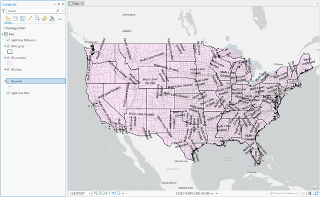
In the Contents, we should see the names of the four layers added to a Map. Roads and rivers are presented in the “line,” and States and counties are “polygon” vectors filled with colors.
The default Contents pane shows the layers in the order they are drawn, with the bottom layer drawn first and the top layer added later. The top layer covers the rest of the layers, so if your States_poly layer was added last, you might not see the other three layers on the Map. To view the Counties layer, drag the States polygon to the bottom of the Contents. Now you can only see the County boundary as US_counties covers all three other layers. Similarly, drag the US_rivers to the top of the Contents to visualize it; however, you still cannot see the counties and roads.
Regardless of the drawing order, let’s make all the layers (base map, states, county, rivers, and roads) visually available.
Change visualization with the Symboloby tool
1. In the Contents, click the states_poly layer to select it.
2. On the ribbon, the Feature Layer contextual tab set appears.
3. On the ribbon, under Feature Layer, click the Appearance tab. In the Drawing group, click Symbology.
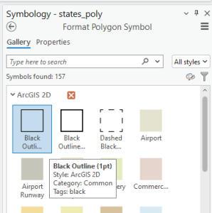
4. The Symbology pane appears on the right side. Click the “squared with color” in the Symbol and choose Black outline. This option will create states_poly with no fill color, but only a black outline:
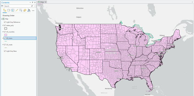
Then, we can see both state and county boundaries:
Stop and check: But we still cannot see rivers and roads because of the “drawing order rule” of ArcGIS Pro. So, we will make US_counties “transparent” to visualize rivers, roads, and base maps.
5. In the Contents, click the US_counties layer to select it.
6. On the Ribbon, click the Feature Layer box and put the number 50 in the Transparency.
The current river and roads are thin lines that are randomly assigned by ArcGIS Pro. You will change the line symbology to make these look more realistic.
7. In the Contents pane, click the colored line under US_rivers to select it. Ensure that the Gallery is displayed in the Symbology pane.
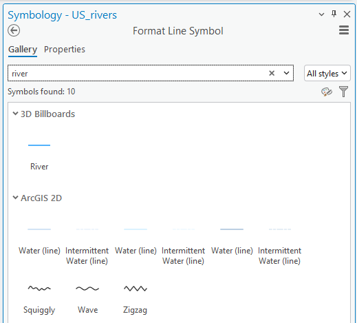
8. Type river in the blank and choose Water (line):
9. Repeat changing symbology with US_roads.
Stop and check: You can also choose another symbol or color. For example, suppose you are not satisfied with the built-in ArcGIS Pro river category colors and symbols. In that case, you can manually choose your own by clicking a color in the Symbology pane.
Label Features
We will add labels to the river and road layers, but we need to check which “item” in the attribute is suitable for labeling.
1. Right-click the US_roads and click Attribute Table
Stop and Think: What kinds of items did you find? What item will you use to label the road?
2. Close the attribute table to see the full Map view
3. Right-click the US_roads and click Label
4. The default labels appeared, but it does not look appropriate as road labels as we expected:
5. To change the default label, let’s investigate the information that the roads layer contains in the attribute table. Right-click on US-roads and click Attribute Table:
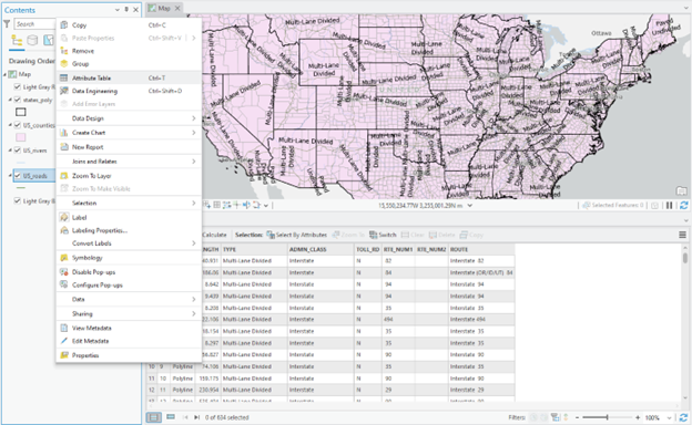
It turns out the US_roads layer provides road type, class, route name (ROUTE), and beyond. We will choose ROUTE to label the roads.
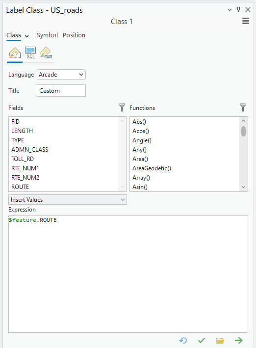
6. Close the attribute table. Then right-click US-roads and click Label Properties…
7. First, remove the current Expression. Then, scroll down in the Fields, find the appropriate item, and double-click it. Click Apply:
8. Then, change the line color and width of the road. Right-click US_roads and click Symbology
9. Click a short line in Symbol, then Properties will be available:
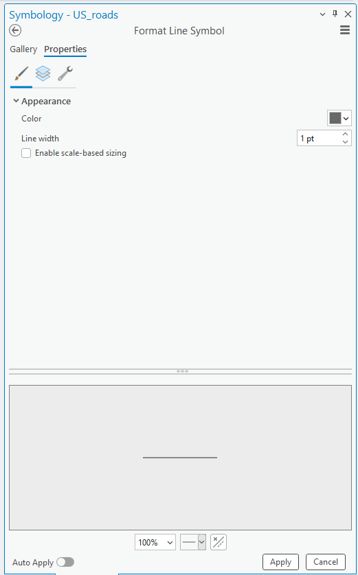
10. Change the Color and Line width that you think are appropriate to represent the road
11. Repeat the labeling steps with the US_river layer.
Figure 1 (0.5 pts.)
Make a screenshot of your current ArcGIS Map view. (Tip: It should present rivers and road line vectors with labels on them.) Feel free to change colors that make sense to you!