
5. Create choropleth maps
The outcome (and pinnacle) of the GIS task is Mapping! Creating presentation-level maps is a key competency of a geospatial analyst. In this part, we will make our first (!) maps of the county-level demography whose data are from the 2020 census.
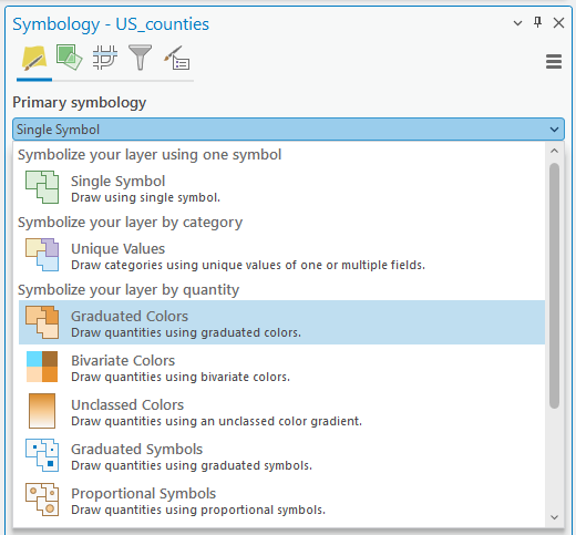
1. Open Symbology of the US_counties and change Single Symbol to Graduated Colors:
2. Confirm the Field is P0010001, which is the total population. And change Classes to 7:
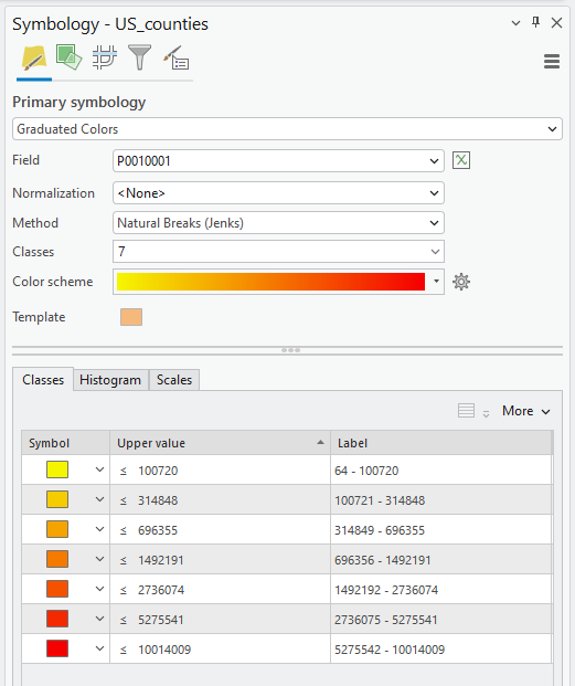
Heads up: As you can see, the default Method is Natural Break (Jenks). The method is for a data grouping scheme in a choropleth map. After examining the data characteristics, you need to decide which classification method is appropriate for your map. An inappropriate classification method can easily mislead and manipulate the maps. A more in-depth discussion will take place during the Week of “Critical Cartography.”
3. Zoom in on the state that you want to make a map of.
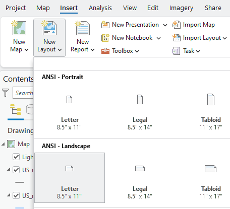
4. On the ribbon, click the Insert tab. In the Project group, click New Layout to show page size and orientation options:
5. You need to choose the map orientation, e.g., Portrait or Landscape, based on the state you selected. As an example, I chose North Carolina, which stretches from east to west, so “Landscape” is suitable for my map:
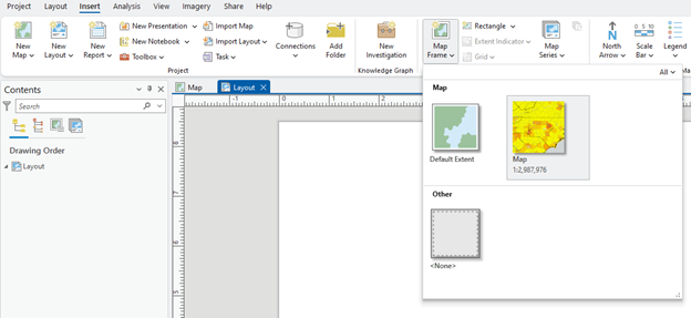
6. On the ribbon, in the Insert tab, click the Map Frames group, and then click the Map Frame drop-down menu. Choose your zoomed-in map:
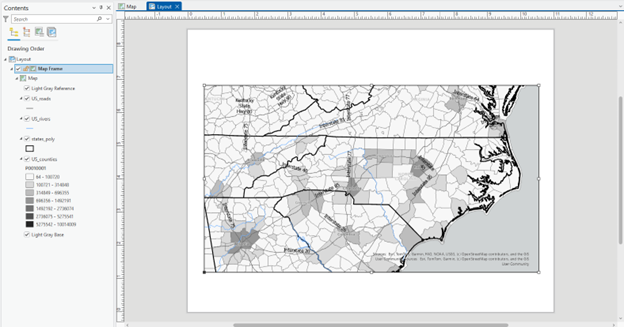
7. Using your mouse, draw a large rectangle on the layout to create the map frame. Here is an example. Space outside of the figure will be used to put map elements, e.g., title, legend, scale bar, and north arrow:
8. Click the Insert tab and find the North arrow, scale bar, legend, and text:
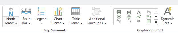
Helpful Tip: Check the Contents pane. You can find the Layout category, which includes map elements, Legend, North Arrow, and more. On the right side of your ArcGIS Pro, you can find multiple tabs at the bottom: Catalog, Geoprocessing, Symbology, and Element. Explore these windows to make changes to your map.
Export Map
After editing your map (for now, try your best to make it neat and stay organized), export the layout in a figure format.
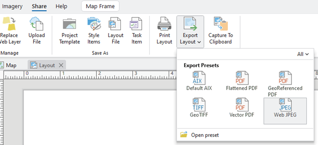
1. On the ribbon, click the Share tab. Click the drop-down icon in Export Layout and select the desired option. Now, you can find the map file in your workspace:
2. Save the project.
We have now completed a map of the county-level total population. We will create one more map that shows another demographic of the state.
3. Click the Map and open the Symbology of US_counties.
4. In the Symbology pane, choose a different demographic in the Field. Please remember how to find demographic categories in the 2020 Census State Redistricting Data (Public Law 94-171) Summary File (Reminder: The metadata for the census is available 2020 Census State Redistricting Data (Public Law 94-171) Summary File)
5. In the Layout, you can find the “legend” changed to your chosen demographic. Make a map with it.
Make the map look as neat as possible. Try your best to make your map neat – we will have another week of focus on cartography and mapping in GIS, so don’t be overly obsessive this time! However, the essential map elements you should include are:
- Title
- Figure
- (Optional) County name labels
- Scale bar
- North arrow, and
- Legend
Question (1.0 pt.): Map interpretation (~ 150 words)
Visually examine the spatial patterns of two maps. Where do you find the spatial cluster in your maps, and what could affect the pattern? And describe the similarity or discrepancy between the two demographics and discuss what might cause it.