
5. Work with Attribute Table (2): Edit Fields Name
So far, we have opened and read the attribute table to understand the types of informational data involved in the figure. In this section, we will edit the preexisting (or “default”) item names to help users recognize the information in the attribute table. Here is the reason why: open the attribute table of Monroe_BlockGroup_2025_UTM_tree_imp, and we can find two MEAN—one for the tree canopy and another for the imperviousness. However, the readers (or even the GIS analysts who create this data) are unable to identify which MEAN corresponds to which.
To clarify the information of the item, we will perform a table edit to change the field name: Edit Alias in the attribute table.
1. Open the attribute table of Monroe_BlockGroup_2025_UTM_tree_imp. Right-click the first MEAN and click Fields.
2. Scroll down on the Fields: Monroe_census_track_tree_imp window, find the first MEAN, and change it to “Tree_pct_MEAN”:
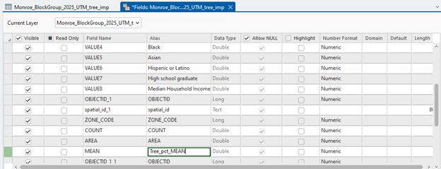
3. Change the second MEAN to “Impervious_pct_MEAN”
4. Close the Fields: Monroe_BlockGroup_2025_UTM_tree_imp. Click Save to the Unsaved Changes Found message.
5. Close the attribute table
Our goal is then to analyze the spatial patterns of tree canopy cover, imperviousness, and demographics in Monroe County. We will create these maps by:
6. Open Symbology of Monroe_BlockGroup_2025_UTM_tree_imp, choose Graduated Colors in Primary symbology, and change Field to “Tree_pct_MEAN.” Also, choose the Color scheme that best represents tree cover.
The last task generates scatter plots of these three variables by:
7. Right-click Monroe_BlockGroup_2025_UTM_tree_imp, find Create Chart, click Scatter Plot Matrix, and choose 1) Total population, 2) Median Household Income, 3) Tree canopy cover, and 4) Imperviousness in Variable, and check the Show linear trend box:
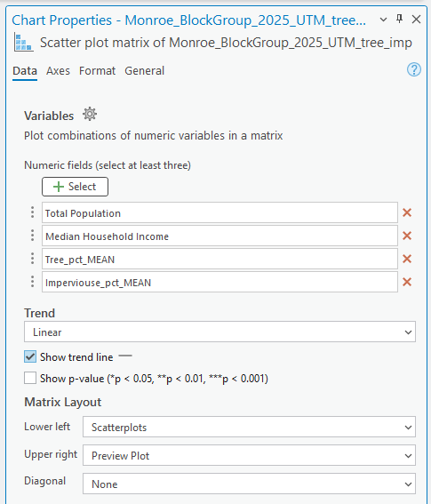
Figure & Question
- Figure 1 (1 tps.): Take a screenshot of the scatter plots showing the relationships in 1) total population, 2) median household income, 3) mean tree cover (%), and 4) mean imperviousness (%) in Monroe County.
- Figure 2 (2 tps.): Create a professional-level map of 1) total population, 2) median household income, 3) mean tree cover (%), and 4) mean imperviousness (%) in Monroe County.
- Written up (2 pts.): Summarize the relationship between tree cover, imperviousness, and poverty in Monroe County based on the three choropleth maps and scatter plots with a 100 to 150-word count.
For extra credit, consider adding more variables, such as race, ethnicity, and age groups, to your analysis.