"

1. Explore the lab dataset using scatter plot

Before diving into changing the visualization of the dataset, we will create scatter plots to analyze the patterns and relationships in the 2020 census.

1. Open ArcGIS Pro and add the “US_counties_acs.shp

Stop and Fix it: The US_counties_acs.shp appears to be located in the middle of the ocean, which is totally incorrect.:

A digital map interface showing a simplified map of the United States, including Alaska and Hawaii, on a light blue background. A "Contents" panel on the left lists map layers such as "USA_counties_acs" (selected), "World Topographic Map," and "World Hillshade.
A GIS interface displaying a map of the United States and Alaska, with selected data layers including county boundaries and topographic features.


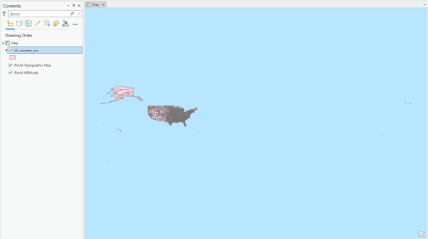
We must correct the geographic location issue before proceeding with further analysis. What made this layer located in the wrong place?  How can we relocate the US_counties_acs.shp to the North American continent?

2. Right-click the US_counties_acs.shp, select Attribute Table, and check the variables in the top row. Then, close the table window.

3. To better learn the demographic and poverty data, let’s create charts to analyze the data distribution and relationship between variables preliminarily.

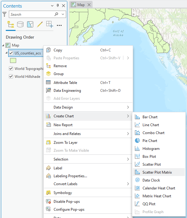
4. Right-click the “US_counties_acs.shp,” select Create Chart, and click Scatter Plot Matrix:

A screenshot of GIS software showing a map view of Alaska on the right and a "Contents" pane on the left with layers such as "US_counties_acs," "World Topographic Map," and "World Hillshade." A context menu is open with options for data visualization, layer management, and symbology settings.
A GIS software interface showing a map of the Gulf of Alaska with a context menu open for creating various chart types, including bar, line, pie, and scatter plots.

5. Select all demographics and poverty, like the figure below:

A screenshot of the Chart Properties panel in GIS software, configuring a scatter plot matrix for US counties using ACS data. The panel includes selected numeric variables such as Total, White, Black, American Native, Asian, Native Hawaiian, Male, Female, and Poverty percentage. Options for linear trend lines and p-value display are enabled. Matrix layout settings define scatterplots in the lower left, preview plots in the upper right, and no diagonal elements. Sorting is set to custom criteria in ascending order.
Chart Properties panel for configuring a scatter plot matrix of US counties using ACS data, with selected demographic variables, trend line options, matrix layout settings, and custom sorting preferences.

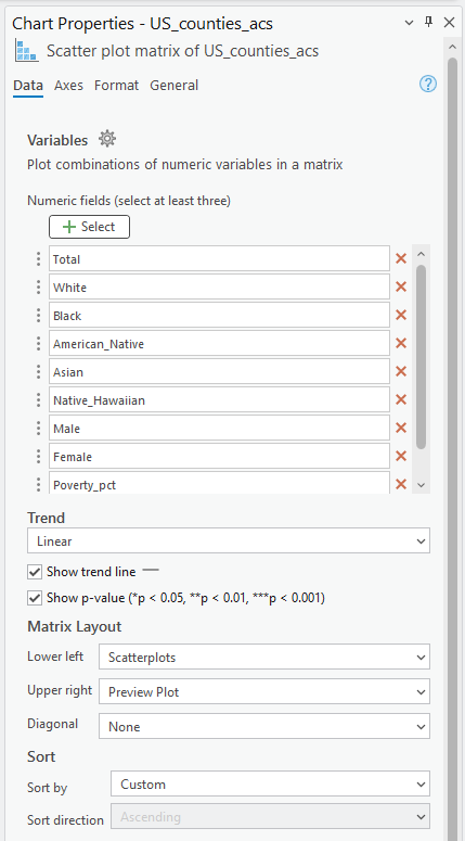
6. The matrix of plots pops up under the Map frame. You can add the trend line and R2 by clicking the Show Linear Trend box in the Chart Properties.

Question (2 pts.)

  1. Make screenshots of three charts that you found interesting
  2. What relationship patterns did you find in your plots?
  3. What other demographic data do you want to analyze more?

7. Close the plot window after exploring it.

License

Intro GIS Labs Copyright © by yurikim. All Rights Reserved.