
Accessibility and Usability
Document Accessibility for Screen Readers
If a student is using a screen-reader to read an etext, a Word or PDF document, or content in your Canvas site, the text needs to be formatted so that the screen-reader can process it properly. Screen readers are not like audiobooks. Please take a few minutes and listen to someone using a screen-reader to hear how very different of an experience it really is. The following video shows Mary Stores of IU’s Assistive Technology & Accessibility Centers using a screen-reader to try to read parts of a Canvas site. (6:59)
Using Built-in Styles
Headings are an important part of creating the visual hierarchy of your page or document. You can see on this page how larger headers are used to note different topics and slightly smaller headers separate subtopics within a section. Providing a visual hierarchy improves the usability of your materials by communicating the document structure. For a fuller description, see Visual Hierarchy: How Well Does Your Design Communicate? by Steven Bradley.
When adding headings to your OER (whether that’s a Pressbook page, a Word doc, or a Google Doc) you need to format your headers using the built-in styles in the text editor (e.g., Heading 1, Heading 2, Heading 3) instead of just making text large and bold. All modern authoring tools offer different levels of headers that you can use to create an outline of your document to provide a visual hierarchy so that screen-readers can use it for navigation.
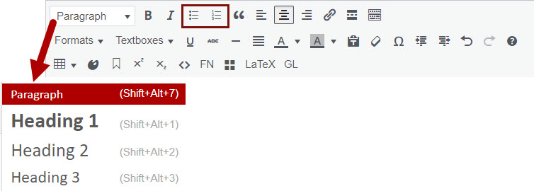
You’ll also want to use built-in styles for bulleted lists and numbered lists instead of trying to create them using tabs or spaces. As Mary demonstrated in the video, these styles provide important information to a screen-reader. They also look a lot better, especially when your text wraps around to a second line.
Use Alternative Text for Images
Alternative text (commonly called “alt text“) is invisible text attached to images. It is read aloud by a screen reader, enabling someone who can’t see the image to hear what it is. You can add alt text in Pressbooks by clicking on an image and clicking the “edit” pencil icon. You can also add alt text in programs such as Microsoft Word and PowerPoint. See the resource list at the bottom of this page for instructions for a variety of programs.
Generally speaking, alt text shouldn’t be much longer than 125 characters. If you need more than that, you may want to consider explaining some parts of the image in the surrounding text.
Alt text should never be the file name of the image.
To get you started writing alt text, here are some basic guidelines depending on the purpose of the image.
Active Images

- Active images serve as a link or button. Clicking it or hovering over it causes something to happen.
- Use alt text that conveys the function of the image (for example, “Go to the IUPUI Library website”).
Informational Images
- Informational images convey information that is not given in a caption or the body of the content.
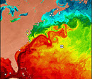
- Use alternative text that conveys the information you want the reader to get from the image (for example, “visualization of ocean temperatures off the Atlantic coast of the US showing an increase in temperature from north to south”)
Decorative/Redundant Images

- The image is redundant to the text or conveys no information.
- The alt text field should be blank. While you can certainly add alt text saying “vase of yellow daffodils,” it’s not necessary if the image of the vase of daffodils is not providing information related to the rest of the content on the page.
Textual Images

- The image is of text.
- Use alternative text that is the same as the text in the image.
NOTE: If you have an image of text (like a screen capture of an article or book) where the text is longer than 125 characters, don’t use the image. Type the text into your document so that it is readable to screen readers and so that students with low vision can enlarge the text as needed.
Avoid Using Tables Purely for Formatting
Tables are (mostly) for tabular data. The use of tables in etexts, documents, and in Canvas presents a special challenge for individuals using assistive technology. Screen readers read tables literally by column and row. For example, the following table used to format a class schedule
| Department Code | Class Number | Section | Max Enrollment | Current Enrollment | Room Number | Days | Start Time | End Time | Instructor |
| BIO | 100 | 53264 | 90 | 86 | SC 150 | T, R | 10:00 am | 11:20 am | Jackson |
| 100 | 53265 | 45 | 45 | SC 256 | M, W | 6:30 pm | 8:00 pm | Rahmani | |
| 205 | 53279 | 45 | 32 | SC 224 | M, W, F | 1:00 pm | 1:50 pm | Alexander |
is read aloud by a screen reader like this:
|
|
Click the speaker icon to hear audio of the table being read aloud as a screen reader would. Note: This audio is slowed down significantly from a normal screen reader pace. |
Now, based only on the audio or the information in the gray box above, where is Dr. Rahmani’s biology class located? See how difficult that is? Even though the top row looks like a header row, it wasn’t set as such in Canvas so it’s not telling you what column each item is in. This is especially unhelpful when everything shifts after row 2 because the first cells in rows 3 and 4 are left blank.
The following Grading Scale table has header rows set properly. You can’t see a difference visually but you can hear it.
| Letter Grade | Percent | Points |
|---|---|---|
| A | 100 - 90% | >899 |
| B | 80 - 89% | 800-899 |
| C | 70 - 79% | 700-799 |
|
|
Click the speaker icon to hear audio of the table being read aloud as a screen reader would. Note: This audio is slowed down significantly from a normal screen reader pace. |
Using tables to organize information in columns and rows can be done if the information is written with accessibility in mind and if the table is formatted correctly. For example, a rubric in a table can be more or less accessible depending on how it is written. If you can read directly across any row and have it make sense then it is much more accessible than our class schedule option above. For example, the following rubric from Berkeley makes sense both when displayed in the table and when read aloud.
| Argument | 5 points: The argument pertains to the relationships between social factors and educational opportunity and is clearly stated and defensible. | 3 points: The argument pertains to the relationships between social factors and educational opportunity but is not defensible using the evidence available. | 1 point: Social factors and educational opportunity are discussed, but no argument is presented. |
|---|---|---|---|
| Interpretation and Use of Data | 5 points: The data is accurately interpreted to identify each school’s position within a larger social structure, and sufficient data is used to defend the main argument. | 3 points: Data is used to defend the main argument, but it is not accurately interpreted to identify each school’s position within a larger social structure, and it might not be sufficient. | 1 point: Data is provided, but it is not used to defend the main argument |
|
|
Click the speaker icon to hear audio of the table being read aloud as a screen reader would. Note: This audio is slowed down significantly from a normal screen reader pace. |
Resources for Accessible Documents
BC Campus Open Education Accessibility Toolkit
Creating an Accessible Syllabus using Microsoft Word by IU IT Training
PowerPoint Accessibility Tutorial from SUNY Oswego
Microsoft and Adobe How-to’s
