
1.2. Finding the data
Many tools are available to IU faculty for seeing student online behavior. A few are highlighted below. Consider viewing these dashboards in your courses and explore what information is available.
Canvas
Course Analytics
Canvas Course Analytics aggregates and presents activity, assignment submission, grade, and participation data for each student. The color-coded visualizations help instructors see, at a glance, which students are performing well and which are at risk.
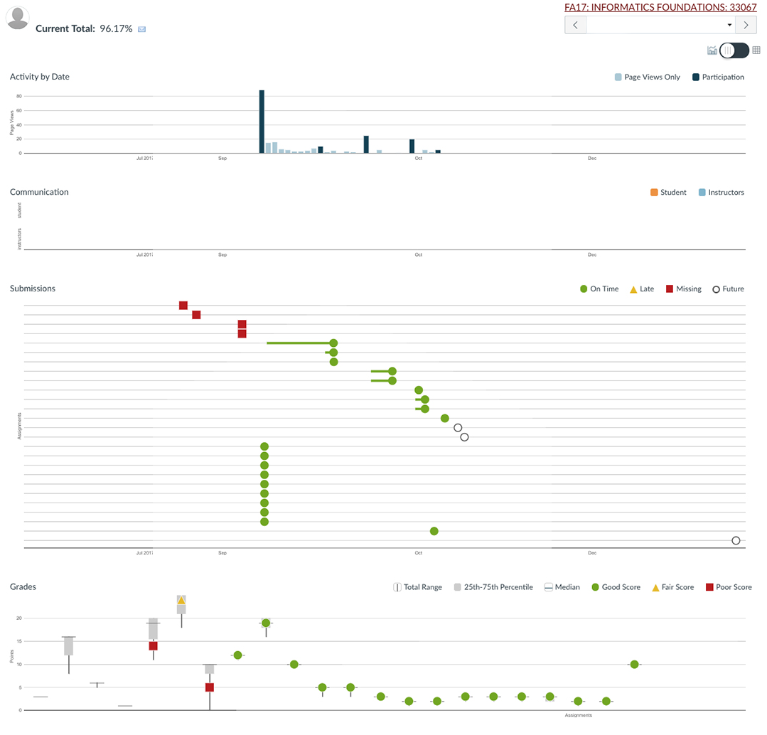
Example of use
Imagine you noticed that many of your students missed a particular question on a quiz. You thought you’d covered the concept adequately on a page in Canvas, so you review your Course Analytics dashboard to find out how many students opened the page. On review, you discover that only 3 students accessed the page! Later, you ask the class why this is, and discover that they hadn’t seen the page — it was available only from a link that they missed. You adjust the page to ensure that it’ll be more visible next time.
 Visit Canvas Course Analytics in the Tool Finder for more information.
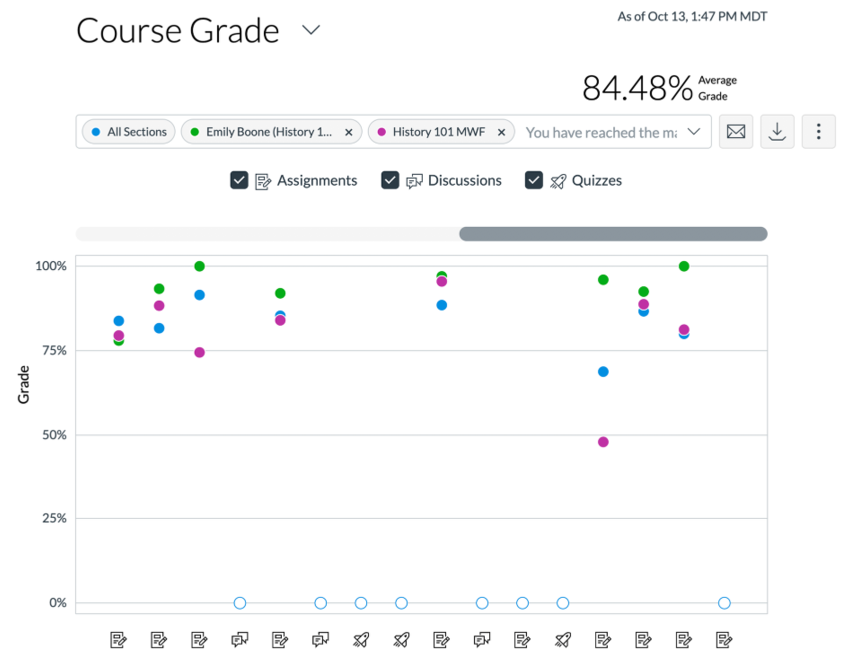
New Analytics
Like Canvas Course Analytics, New Analytics aggregates and presents activity, assignment submission, grade, and participation data for each student. The color-coded visualizations help instructors see, at a glance, which students are performing well and which are at risk.
Visit What is New Analytics? for more information.
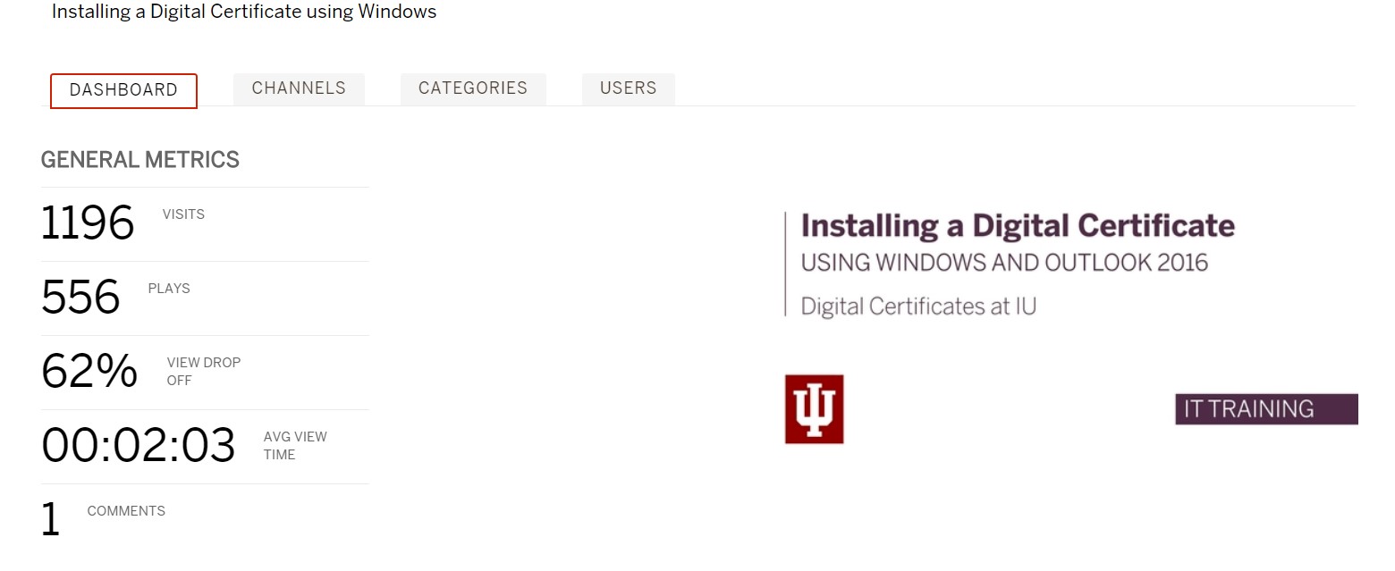
Kaltura
Kaltura analytics give you a window into your students’ video-watching behavior: you can see the number of times your students viewed a video, how often they stopped watching a video partway through – and at what point they stopped watching the video, and more.
Example of use
You record short videos every week for your students. Sometimes it’s new content; oftentimes it’s an overview of important concepts they should understand. As you review the analytics, you notice that over half of the class paused and rewound at a certain spot. You want to understand what’s going on there.
Watching the video at that timestamp may help you diagnose student behavior. Perhaps you used a new term, and students paused to write it down. Or maybe your explanation of the concept was confusing, and they needed to rewatch it to understand. Or, perhaps you stuttered, your dog barked, or the sound went out. Regardless, use this information in conjunction with student feedback. In class or an ungraded survey, let them know your analytic findings and get their feedback as to why they paused the video and consider this information when planning your next video.
Visit About Kaltura analytics for more information.
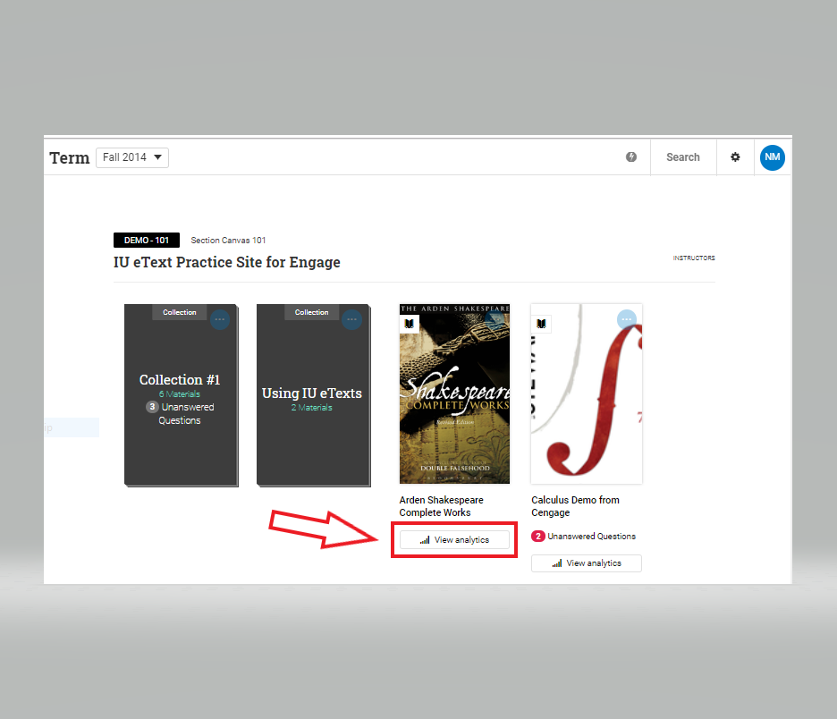
Engage
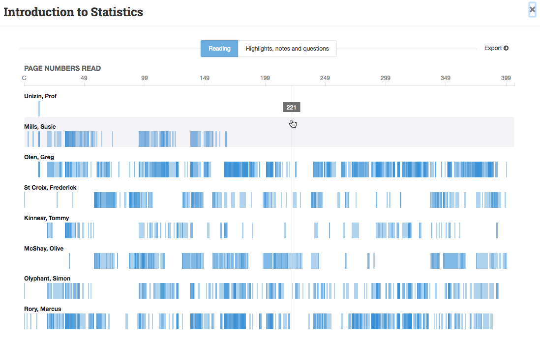
Engage, the ereader for IU eTexts, provides analytics that offer you useful feedback about student reading behaviors. Such information can be useful in student conferences and/or may help you plan/review class time activities.
To find the analytics for a text, start on the Engage library home page. Click on the Analytics link underneath a material’s tile to launch Engage Analytics.
By default Engage Analytics opens to the Reading View. With only a quick glance, you can get a great deal of information about your students’ behaviors in the text.
A light blue bar indicates the student has visited the page. A dark blue bar indicates the student has re-visited the page. You can click on any part of the graph to view more specifics about the student’s activity in the text.
This graph is never the complete picture. It does not calculate students who choose to use the reader app, or those who read on paper.
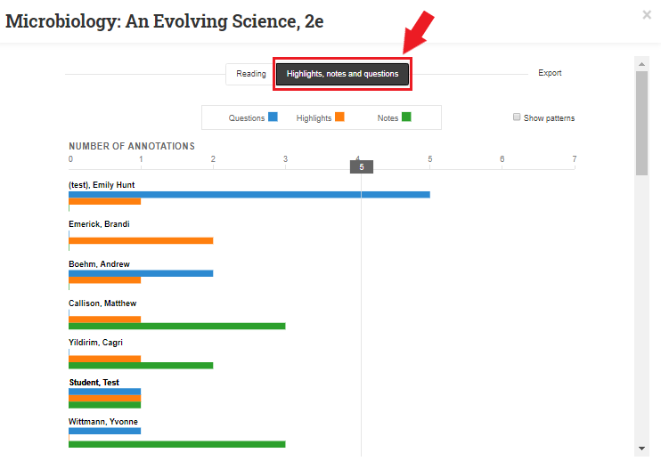
You can also view how students are engaging with the text by clicking on the Highlights, Notes, and Questions tab to open Engagement view. This view shows the quantity and type of markup that each student has made in the course material. Click on the chart to get more detailed information.
For more information about using Engage Analytics, see the Unizin user guide – Using Analytics.
Other services
Additional dashboards are available.
