
Part 3: Developing a Welcoming Course
Improving Accessibility in Course Materials
The hope is that, when faculty create assignments and materials, they take some time to think about how students with disabilities would interact with them and consider adjustments that they could make should a student need an accommodation. An even better approach is to think about your course from the perspective of accessible design from the beginning. Integrating accessibility as you develop your course is much easier than going back and retrofitting a course after the fact and is a good way to address the most common accessibility blockers that your students may encounter.
We’ll talk about video and audio materials in the next section, but here we’ll look at four simple practices to improve accessibility when creating written materials. If students are using a screen-reader to read a document or your Canvas site, they need to be formatted so that the screen-reader can process the text properly for the student. It’s easier to do that as you’re writing the document in the first place.
Screen readers are not like audiobooks. Please take a few minutes and listen to someone using a screen-reader to see how very different of an experience it really is. The following video shows Mary Stores of IU’s Assistive Technology & Accessibility Centers using a screen-reader to try to read parts of a Canvas site.
Using Built-in Styles
When adding headings to your document or Canvas page, format your headers using the built-in styles (e.g., Heading 1, Heading 2, Heading 3) instead of just making text large and bold. Canvas, Word, and Google Docs all offer different levels of headers that you can use to create an outline of your document that screen-readers use for navigation as in the video. As you’ll notice, heading styles make text larger and sometimes bolder but make sure you do not use header styles simply to format text. You can increase your font size and add bold or italics by using the font size tool and the bold and italics buttons.
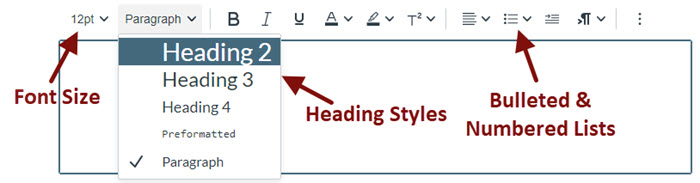
You’ll also want to use built-in styles for bulleted lists and numbered lists instead of trying to create them using tabs and spaces. As Mary demonstrated in the video, these styles provide important information to a screen-reader. They also just look a lot better, especially when your text wraps around to a second line.
Using Concise & Meaningful Link Text
If what you are writing is going to be distributed electronically on a Canvas page, Word file, or PDF file, it is important to use concise and meaningful link text. If the link text is meaningless or too long, students using screen readers have trouble figuring out where the link will take them. Keep link text concise and make sure that it makes sense out of context.
- Don’t use URLs as link text. (Imagine the link being read aloud to you twice.) Only use URLs if you are printing a resource and do not intend for the users to have a digital copy.
- “Click here” is generally problematic. “Contact ATAC” is better than “Click here to contact ATAC” as screen reader users cannot see where “here” is.
- If an image serves as a link, the alternative text of the image serves as the link text, so make sure that the alt text follows the guidelines for links.
Use Alternative Text for Images
Alternative text (commonly called “alt text“) is invisible text attached to images. It is read aloud by a screen reader, enabling someone who can’t see the image to hear what it is. You can add alt text in Canvas by clicking on the image and then on the picture icon on the toolbar of the text editor. You can also add alt text in programs such as Microsoft Word and PowerPoint. See the resource list at the bottom of this page for instructions for a variety of programs.
Generally speaking, alt text shouldn’t be much longer than 125 characters. If you need more than that you may want to consider explaining some parts of the surrounding text. To get you started writing alt text, here are some basic guidelines depending on the purpose of the image.
Active Images

- Active images serve as a link or button. Clicking it or hovering over it causes something to happen.
- Use alt text that conveys the function of the image (for example, “Go to the IU Indianapolis Library website”).
Informational Images
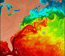
- Informational images convey information that is not given in a caption or the body of the content.
- Use alternative text that conveys the information you want the reader to get from the image (for example, “a visualization of the ocean temperatures off the Atlantic coast of the US showing an increase in temperature from north to south”)
Decorative/Redundant Images

- The image is redundant to the text or conveys no information.
- Use alt=”” for the alternative text. While you can certainly add alt text saying “vase of yellow daffodils,” it’s not necessary if the image of the vase of daffodils is not providing information related to the rest of the content on the page.
Textual Images
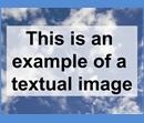
- The image is of text.
- Use alternative text that is the same as the text in the image.
Avoid Using Tables Purely for Formatting
Tables are (mostly) for tabular data. The use of tables in both documents and in Canvas presents a special challenge for individuals using assistive technology. Screen readers read tables literally by column and row. For example, the following table used to format a class schedule
| Department Code | Class Number | Section | Max Enrollment | Current Enrollment | Room Number | Days | Start Time | End Time | Instructor |
| BIO | 100 | 53264 | 90 | 86 | SC 150 | T, R | 10:00 am | 11:20 am | Jackson |
| 100 | 53265 | 45 | 45 | SC 256 | M, W | 6:30 pm | 8:00 pm | Rahmani | |
| 205 | 53279 | 45 | 32 | SC 224 | M, W, F | 1:00 pm | 1:50 pm | Alexander |
is read aloud by a screen reader like this:
|
|
Select the speaker icon to hear audio of the table being read aloud as a screen reader would. Note: This audio is slowed down significantly from a normal screen reader pace. |
Now, based only on the audio or the information in the gray box above, where is Dr. Rahmani’s biology class located? See how difficult that is? Even though the top row looks like a header row, it wasn’t set as such in Canvas so it’s not telling you what column each item is in. This is especially unhelpful when everything shifts after row 2 because the first cell in rows 3 and 4 are left blank.
The following Grading Scale table has header rows set properly. You can’t see a difference visually but you can hear it.
| Letter Grade | Percent | Points |
|---|---|---|
| A | 100 - 90% | >899 |
| B | 80 - 89% | 800-899 |
| C | 70 - 79% | 700-799 |
|
|
Select the speaker icon to hear audio of the table being read aloud as a screen reader would. Note: This audio is slowed down significantly from a normal screen reader pace. |
Using tables to organize information in columns and rows can be done if the information is written with accessibility in mind and if the table is formatted correctly. For example, a rubric in a table can be more or less accessible depending on how it is written. If you can read directly across any row and have it make sense then it is much more accessible than our class schedule option above. For example, the following rubric from Berkeley makes sense both when displayed in the table and when read aloud.
| Argument | 5 points: The argument pertains to the relationships between social factors and educational opportunity and is clearly stated and defensible. | 3 points: The argument pertains to the relationships between social factors and educational opportunity but is not defensible using the evidence available. | 1 point: Social factors and educational opportunity are discussed, but no argument is presented. |
|---|---|---|---|
| Interpretation and Use of Data | 5 points: The data is accurately interpreted to identify each school’s position within a larger social structure, and sufficient data is used to defend the main argument. | 3 points: Data is used to defend the main argument, but it is not accurately interpreted to identify each school’s position within a larger social structure, and it might not be sufficient. | 1 point: Data is provided, but it is not used to defend the main argument |
|
|
Select the speaker icon to hear audio of the table being read aloud as a screen reader would. Note: This audio is slowed down significantly from a normal screen reader pace. |
Resources for Accessible Documents
Creating an Accessible Syllabus using Microsoft Word by IU IT Training
PowerPoint Accessibility Tutorial from SUNY Oswego
Microsoft and Adobe How-to’s
