Kaniyah Rush

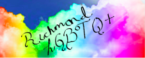
For starters this is an important image, because it represents the fb page of the Richmond LGBQT community. Also, it’s the first image people see, so its important to have a good representation of what the page is about. Having a good image to represent something is important, because without its people want bother to look, nor join. This page having this welcome image is important to help gain support, and joiners. This image makes the viewers want to look more into this page.
Second this image tells the story of a cloudy prideful day. Instead of using a flag with pride colors which is often used to represent the LGBQT community, they chose a different route. This route is showing a cloudy rainbow day which is welcoming to come be a part of Richmond pride community. These clouds don’t have an exact place on it, which makes it so significant, it could represent any an everywhere. The rainbow color itself tells all different stories from life to spirit. The colors like red representing life, violet being for spirit, and green for nature, etc.
Thirdly this should be included in the collection, because the page its self has so many artifacts on it. This page has artifacts like events that took place, or will take place, pictures, etc. all the information use on this page is significant to a pride collection. This information, because of the meaning it holds, from images to events. Also, these events, and information are a part of Richmond building its LGBQT community, which is must be in the collection.
Furthermore, the rhetorical appeals that this image is evoking is ethos, and pathos. This image is inducing the ethos appeal, because the image itself is educating. The image is educating just by showing the pride in a different light, instead of a flag, rainbow clouds. This image also evokes the ethos appeal, because the credibility behind this image. Secondly the image evokes the pathos appeal as well. this image evokes the pathos appeal, because it appeals to viewers emotion, like happiness, and hope.
In other words, this is image was produced to start a pride page for the Richmond LGBTQ community. Members of the LGBTQ community put this page together, to inform other LGBTQ members in Richmond. Everyone is the audience for this image, and pages, because it’s wanting to involve every one of the Richmond community. Its significant to have this image, because its welcome to all sexuality, and gender.
To add, there is a new pride flag that has all the traditional colors but add black and brown. By adding these to color is showing the support of black lives matter. Richmond Indiana uses the original flag, but should look into this new flag, since its so inclusive.
To conclude that this image came from a Richmond pride page. Members of the pride community of the founders of this page. The name, and location makes it distinctly Richmond based. This image uses the rhetorical appeals ethos, and pathos to get people on their page, by appealing to their wanting of knowing what is behind the image. Then red, orange, yellow, green, blue, and purple are the colors used in this image. The intended audience is the members of the LGBTQ community, and the unintended audience is supporters of the LGBTQ community. The affordances of this image are that it so broad, no logo, words, it can pertain to anyone.

